A new type of font has been created by combining letters from the logos of leading brands.
Brand New Roman – a play of the ever-popular Times New Roman – uses the BR combo from ice cream brand Baskin Robbins, the A from Adobe, Netflix’s N and the D from blogcomment hosting site Disqus in its own name.
The font has been created by New York-based digital studio Hello Velocity as a comment on capitalism.
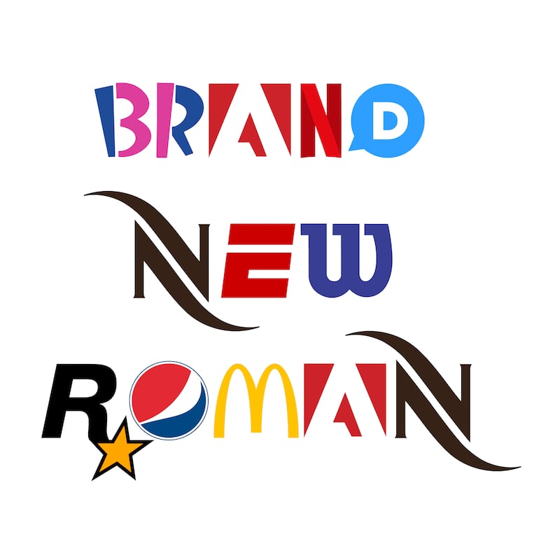
“At this point, brands are inescapably ubiquitous and attention-hungry. What’s interesting about Brand New Roman is that when you smash so many of these brands together they start to lose their powerful brand connotations in fascinating ways,” said Hello Velocity creative director Lukas Bentel.
“The sheer density overrides all the extra brand identity associations each symbol usually carries.”
Weirdly, working out which brand is responsible for each letter is part of the attraction in reading things written in Brands New Roman.
And it takes on a whole new twist when the font is used to rewrite recognisable logos using the alternative lettering.
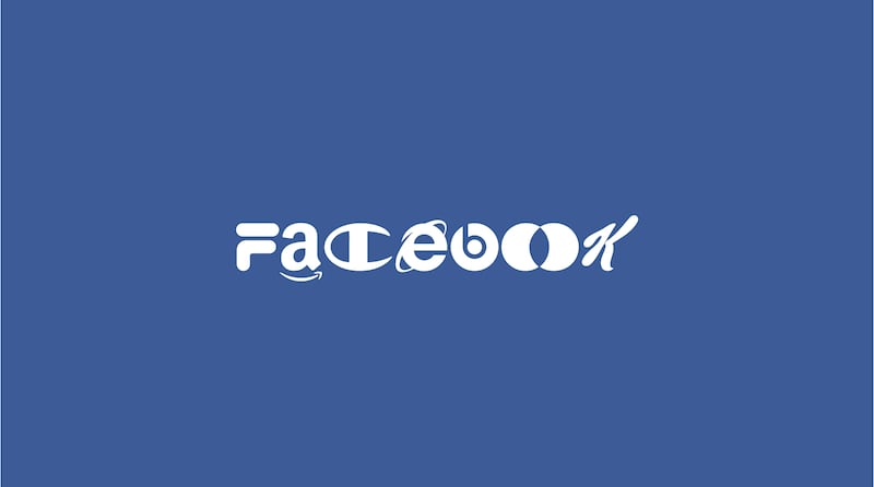
Facebook is recreated with the Amazon A – complete with arrow – the Internet Explorer E, B from Beats and the Kellogg’s K.
Other leading brands have been similarly redrafted.
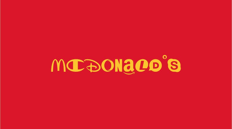
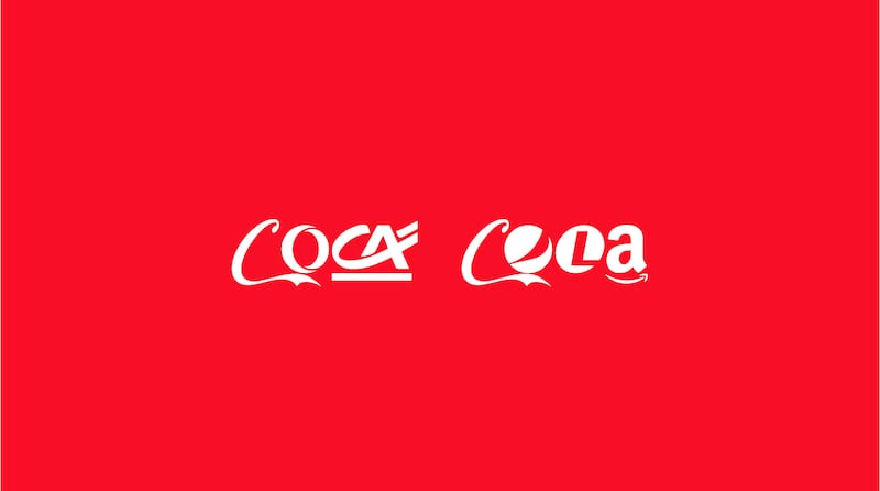
“In the end, I think that Brand New Roman is pretty aesthetically compelling, which makes sense given all the time, money and design that has gone into crafting each of these logos for the purposes of standing out,” added Bentel.
“With Brand New Roman we are making them work together.”
The font has already been used to make a T-shirt.
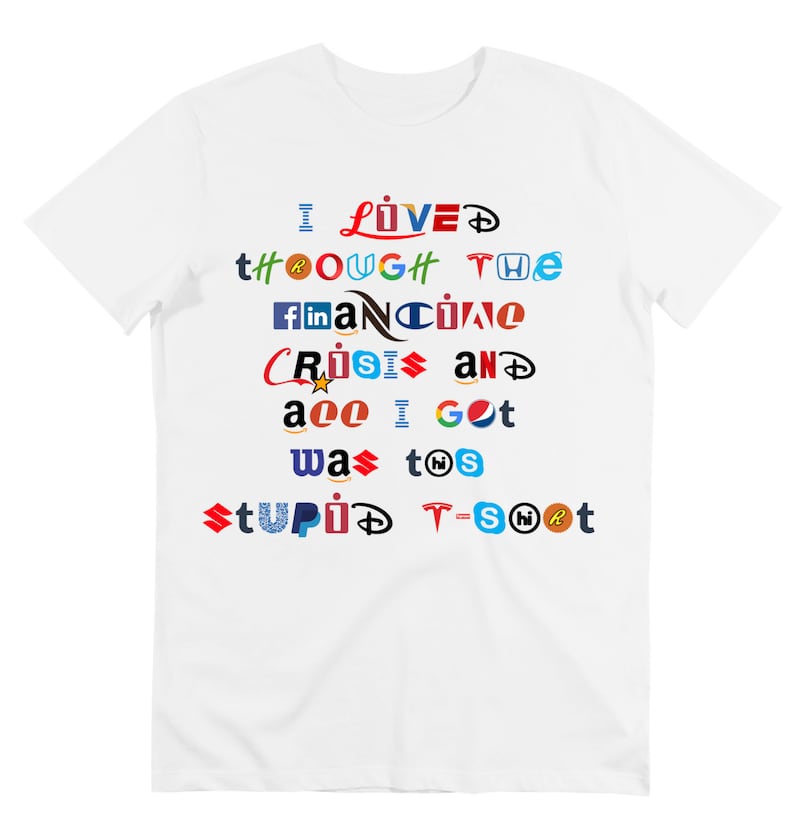
To have a play around with font, visit the Brand New Roman website.
Some letters change when combined with others, for instance a single o is different to a double oo.
Hello Velocity described the font building as a “time-intensive process”.
It had to cut some slack to find a logo which carried a recognisable standalone I. It opted for the capital version from IBM while the lowercase is taken from iomega – the predecessor of Lenovo.


